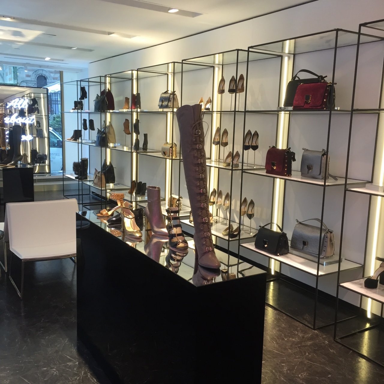
In our previous blog post (part one of our Retail Space series) we discussed three different retail floor plans and layouts, and some of the advantages and disadvantages of each. In today’s post, we will discuss consumer behavior and shopping patterns in retail spaces, to further understand the importance of choosing the correct layout for your space. Designing retail spaces with these studies and behaviors in mind, can greatly impact sales volume and revenue.
Data has been collected over many years, and in multiple studies, to provide retailers with consumer shopping patterns in brick and mortar locations. One such form of data collection involves heat maps, used to analyze where customers spend the most time, and which displays and locations within the store, receive the most foot traffic.
There are a couple behavioral patterns that are seen repeatedly. Such as the flow of traffic in a store typically moving to the right of the entrance. This being said, it is important to have a “Power Wall” or a wall displaying your most popular items, on the wall to the right of the store entrance.
There have also been studies that show that customers spend very little time in the entrance of brick and mortar locations. The “decompression zone” is the space where consumers physically, but more importantly mentally, exit the world outside and enter the “world” of said retail space. Items placed directly in front of the entrance to a store are often overlooked and passed by. It can be beneficial to plan for a visually appealing display at the entrance to a retail store, displaying items besides merchandise, such as signage, flowers, etc. Many customers, often in a hurry, end up in the middle of the store before slowing to look around and get their bearings. A display in the front of the store, acting as a sort of “traffic block” can help to eliminate this from happening. A transition zone helps slow customers pace, as they transition from the exterior of the store, to the interior and into “buying mode.”
The items in the transition zone are often lost on the customers, but can help customers to slow down and begin their purchasing. If traffic flow, and ensuring that all products are visible at the front of the store is a concern, chevroning can be used as a way to display merchandise and shelving units. Chevroning refers to placing shelves or racks at an angle, instead of in the tradition 90-degrees. Often times, the more customers see, the more they purchase. However, with this format, more space is used and less is displayed. This needs to be taken into consideration when determining if chevroning is right for your space.
It is well known that customers do not like to experience the “butt brush” effect, and if customers feel that the space where someone is currently browsing is not large enough for two to browse comfortably, they will inevitably leave the area. As lack of space in corners or aisles leads to less browsing, it also inevitable leads to fewer sales. Having open walkways, and space in front of all racks, shelving, and displays, is crucial for a successful shopping experience for customers.
Secondary products, that can be bought to enhance primary products, are often sold most frequently when placed near and around the primary product. Primary products that sell frequently, should be placed near the back of the store, encouraging visitors to walk through the length of the store to purchase what they need. Shelving and merchandise leading through to the back of the store should be secondary and impulse purchases. Another great use of real estate within a retail location is at the checkout counter. Less expensive merchandise placed near the checkout, encourages impulse buys when a consumer is waiting in line, or on their way to checkout.
Finally, customers spend more time in environments where they feel comfortable and visually stimulated. If a space is cluttered or not visually appealing it can be assumed that customers will be in and out rather quickly. It is also known that the more time customers spend in a retail space, the more they buy. This being said, it is important to consider the design and the visual aspects of a retail space. Lighting, shelving, music, artwork, wall colors, etc. all play into how a customer perceives the space, and can ultimately make or break the customers visit. These factors will often determine the length of time spent in the space, as well as how likely the customer is to return to the store, thus affecting the revenue of the store.


Leave a reply
You must be logged in to post a comment.